Planning guide · Design ideas
Exhibition stall design ideas that start with the visitor.
A useful design idea solves a particular exhibition problem. Before collecting reference images, decide what the visitor should see, do and remember. These six approaches connect a visual direction with the activity it needs to support.
Start here
- Choose an idea around your main visitor action.
- Ask what every feature contributes to the product story.
- Compare the idea on your actual footprint before choosing finishes.
01
Match the design idea to the exhibition goal
Start by ranking your objectives. Launching one product, showing a broad range and hosting private buyer meetings place different demands on the same footprint. Select one primary approach and combine supporting features only where the layout can accommodate them. The table is a briefing tool, not a set of universal layouts.
| Design idea | Best starting brief | Practical trade-off |
|---|---|---|
| Hero product platform | Launch one priority product | The product must remain visible when people stop |
| Hands-on demonstration | Explain a product through use | Allow for operating and watching space |
| Edited sample gallery | Compare a material or product range | Group the range instead of showing every item |
| Meeting-led pavilion | Host scheduled buyer conversations | Balance quieter seating with a readable public face |
| Open corner display | Welcome visitors from two aisles | Keep the corner free from fixed obstructions |
| Reusable brand kit | Attend several shows with changing footprints | Plan packing, storage and future dimensions early |
02
Show one hero product, or let people try it
For a launch, give the hero product a strong backdrop and a clear place in the layout. Use light, a short message and an appropriate display fixture to explain its importance. Supporting products can sit along a secondary surface. A decorative platform is only useful if the product can be presented, accessed and operated as intended.
A hands-on idea changes the design brief. Include the presenter, the participant and anyone watching, with the equipment’s real operating requirements. Position the demonstration so passers-by can understand what is happening before joining. For a long demo, plan the waiting and follow-up conversation rather than allowing both to collect at the entrance.
03
Edit a gallery, or build around meetings
A sample gallery works well when comparison is the visitor’s main task. Group products by application or a clear family, keep labels consistent and leave a place to handle samples where suitable. An edited range is easier to explore than a wall of unrelated objects. Decide what the visitor should compare and what can remain in storage for a qualified conversation.
A meeting-led stall needs an inviting public face as well as seating. Show what you offer before guiding buyers into a quieter zone. Check the number and duration of simultaneous meetings, the host’s route and where product material is kept. An enclosed space can be appropriate, but it should not erase the product story or leave new visitors unsure where to enter.
04
Use openness and reuse deliberately
An open corner idea takes advantage of adjacent aisles by keeping the shared corner visible and easy to approach. Treat the two sides as one visitor experience rather than two independent frontages. For a small footprint, a clear display and a movable host can be more useful than a separate counter on each side.
For a recurring show calendar, a reusable brand kit can include graphic surfaces, display fixtures and modular elements designed for more than one layout. Share likely future footprints before committing to fixed dimensions. Reuse depends on packing, transport, storage and refurbishment as well as the design itself; do not describe a material as sustainable solely because it appears reusable in a render.
05
Turn references into a brief you can build
For every reference, write down the part you value: product visibility, a colour relationship, lighting, display organisation or the atmosphere of a meeting area. Separate those intentions from the exact geometry. Your designer can then adapt the useful idea to your allocated footprint and budget.
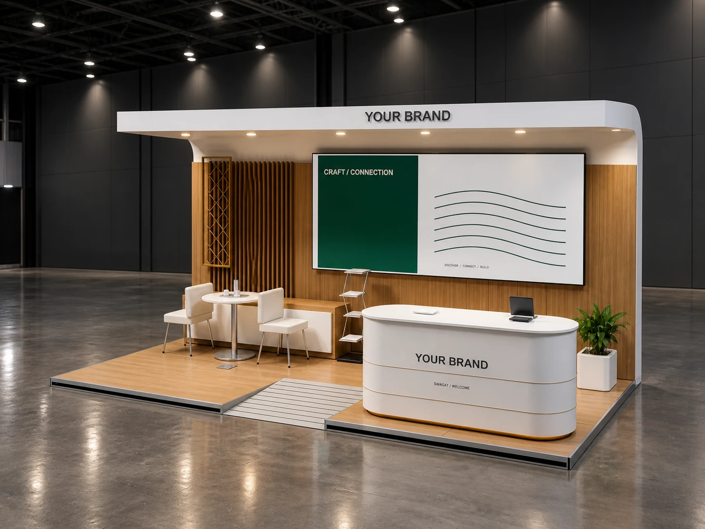
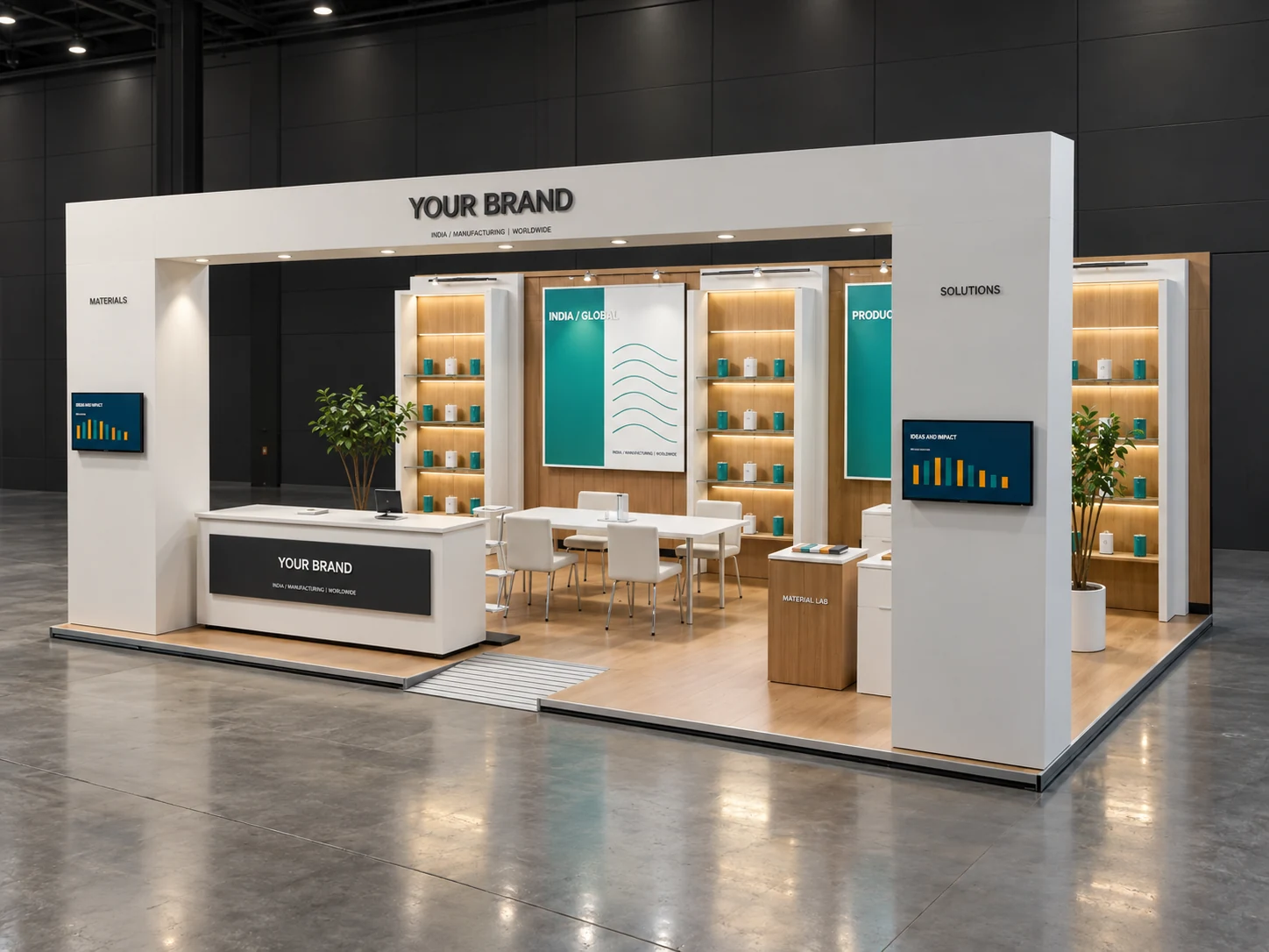
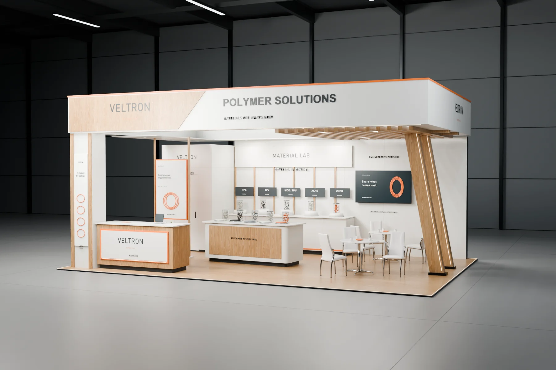
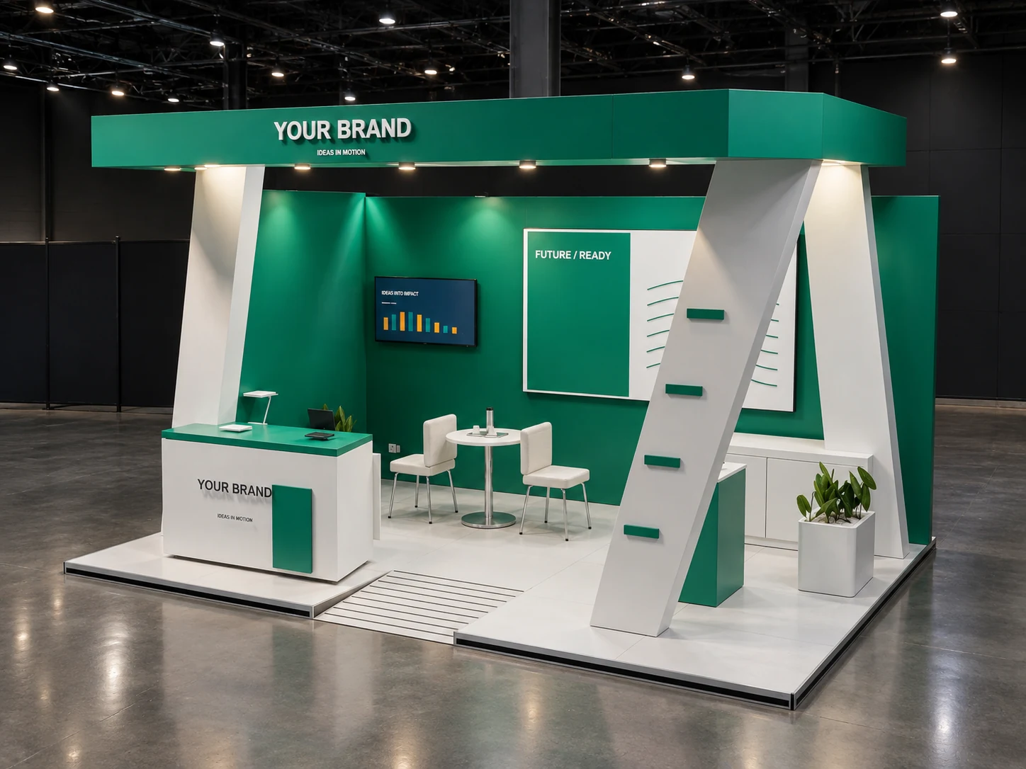
The images on this site are Lumian Studio design concepts and 3D visualisations. They illustrate directions for discussion and are not presented as completed client installations. Before choosing a direction, review the scaled plan, eye-level views, material proposal, event requirements and full delivery scope.
Before you begin
Practical questions.
- Can we combine several stall design ideas?
- Yes, where the footprint and budget support them. Rank the main visitor activity first and remove secondary features that crowd it.
- What should we send with a reference image?
- Explain which part you like, then add the show details, allocated floor plan, products, audience, budget and deadline. That makes the reference useful rather than a request to copy another booth.